Did you know that something as simple as the colour schemes used in your home can affect your mood every day? They can make you feel bright and ready for the day, relaxed and calm, or even hungry!
When you stop and think about how much a crisp set of fresh bedding or a new accessory can perk up your mood, it seems pretty obvious. A jazzy coat of paint on the walls could do so much more than just sprucing them up. Even just slightly adjusting the colours you have in each room of the house can help you with everything from focusing better on your work to getting a good night’s sleep.
Take a look at our fun infographic to help you understand a few of the best colour palettes for a home that has you feeling your best:
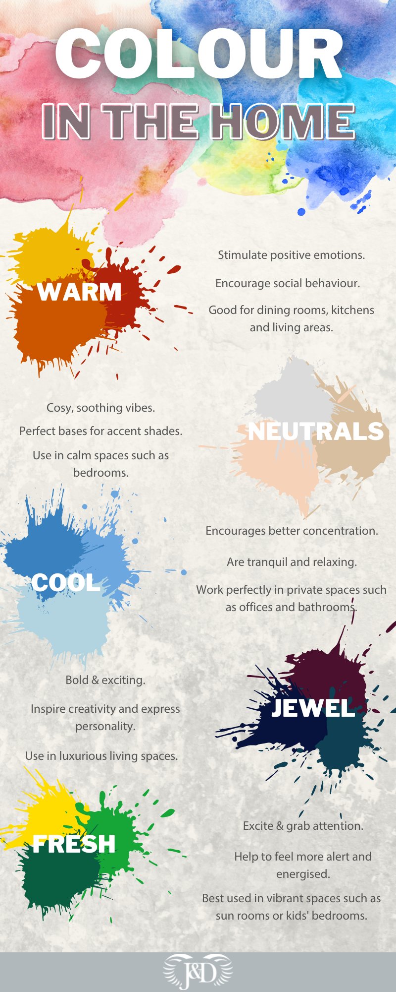
Here are a few of our top colour tips when redesigning rooms in your home:
Warm Colours
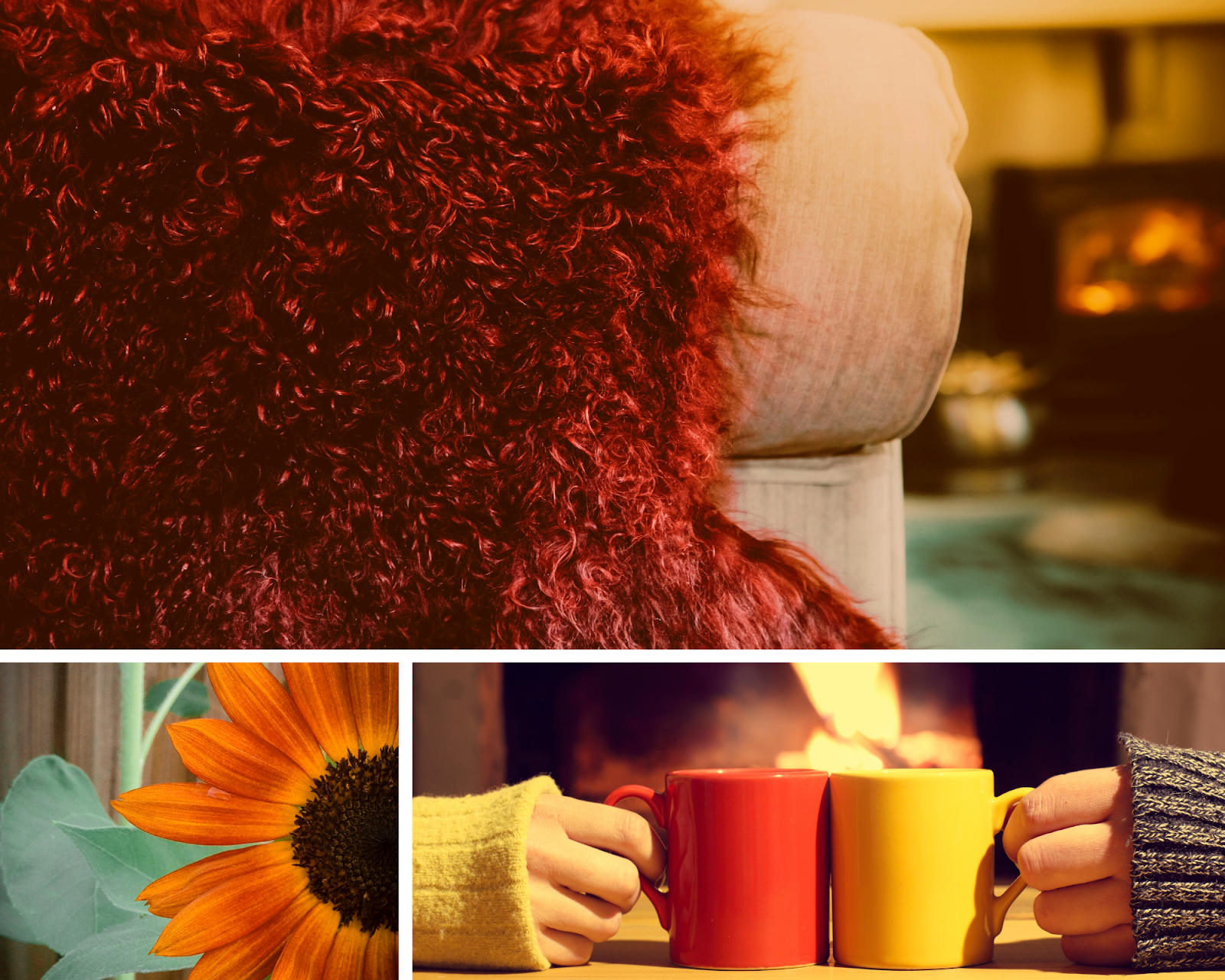
Burnt umber, mustard yellow, terracotta red – this gorgeous warm colour palette is perfect for fall, but did you know it can also stimulate positive emotions and encourage more social behaviour?
We recommend these gorgeous autumnal shades for dining room walls where you want conversation to flow, terracotta tiles on the floor and bold yellow sunflowers in the kitchen to stimulate appetite, and warm red velvet for texture in the living room.
Beware of bright reds though as these can incite strong emotions that veer more towards negative, such as anger and aggression.
Neutrals
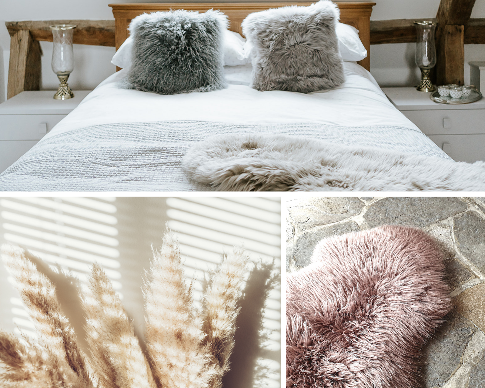
Neutral shades come in all shapes and sizes – warm and cool; greys, whites and blush pinks; browns, beiges and even pale greens. One thing that can be agreed upon though is their smooth, calmness, and the way that they can create the perfect base for a vast range of colour palettes. We love to look to nature for perfect pastel neutrals such as sand, pampas grass and the pale pink of a just blossoming rose.
In a bedroom, neutrals can help to soothe you into a more restful sleep. Pair shaggy natural sheepskins with grounding greige on the walls for a safe and nostalgic vibe, or use a cooler neutral such as sage in a bathroom for a spa-like feel.
There is nowhere that neutrals won’t work in the home, but for sociable living areas, we’d recommend pairing your neutrals with bolder accents to bring life and creativity.
Cool Colours
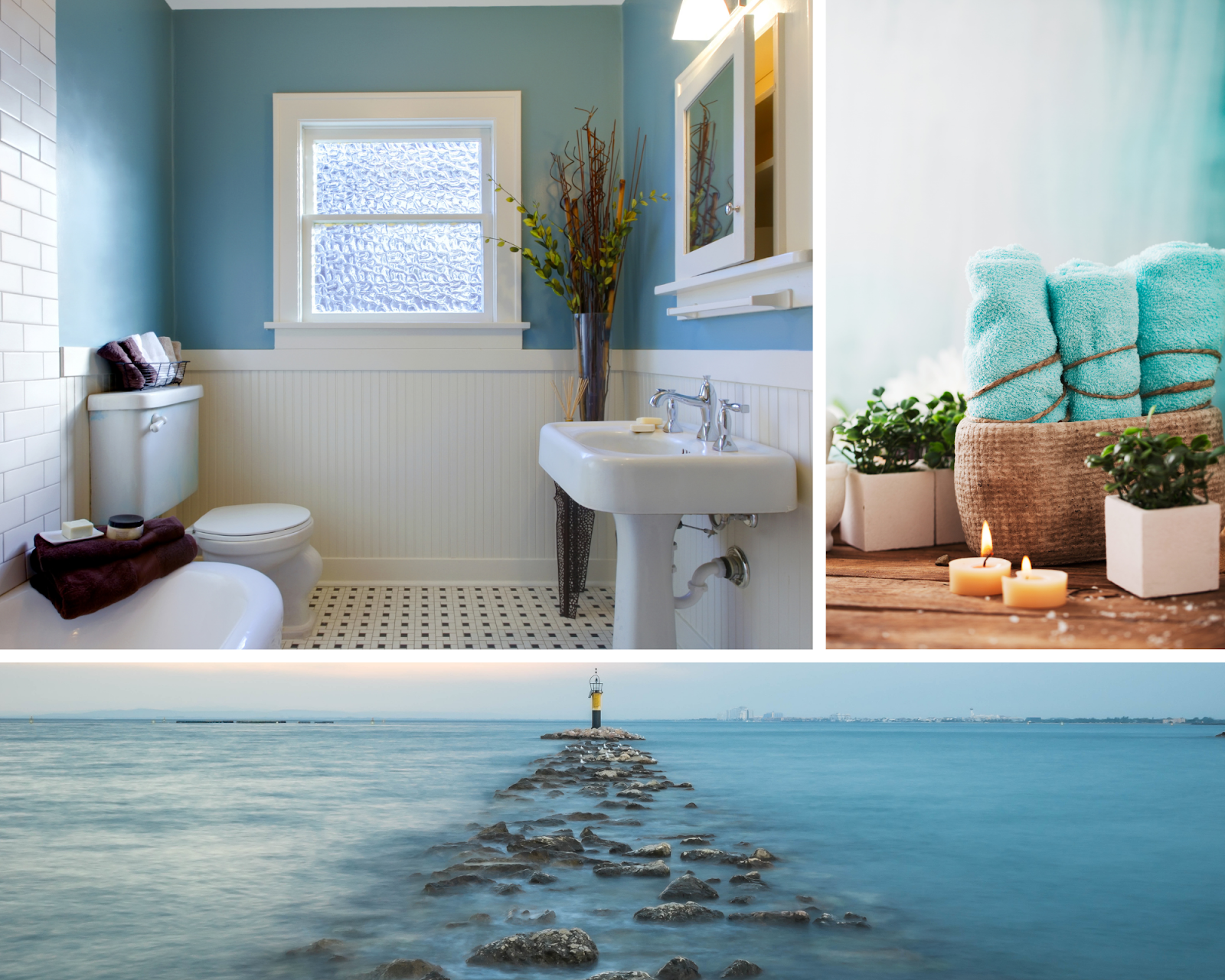
When we talk about cool colours, we don’t just mean your typical blues and greens, although these are of course very classic cool shades. Red and pink can also have cool undertones in lavender or some hues of coral. In contrast to warm colours, cool shades are far more calming and tranquil.
The best spaces for cool colours are those where you want to relax or to concentrate. A home office in a dark blue will be just the place to get in the right headspace for work, or a bathroom in a tranquil shade of sea spray will help you relax before bed but to also feel refreshed in the morning. Be wary of when and where you use your blues though as this is the classic shade of sadness.

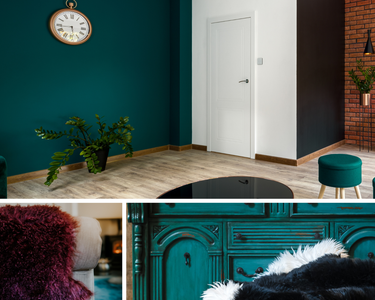
Jewel Tones
Jewel tones such as ruby, emerald and navy are bold and exciting. They can bring a touch of luxury to an interior space when used carefully, especially when paired with fabrics such as velvet and heavy weaves. These shades tie in perfectly with the “grand millennial” trend, and we love how they can inspire a creative mindset and express your personality.
Paired with metallic accessories and elements, these colours add a subtle hint of drama, but beware of going too far as rooms totally bedecked in jewel tones can end up looking heavy and dreary.
Fresh Tones
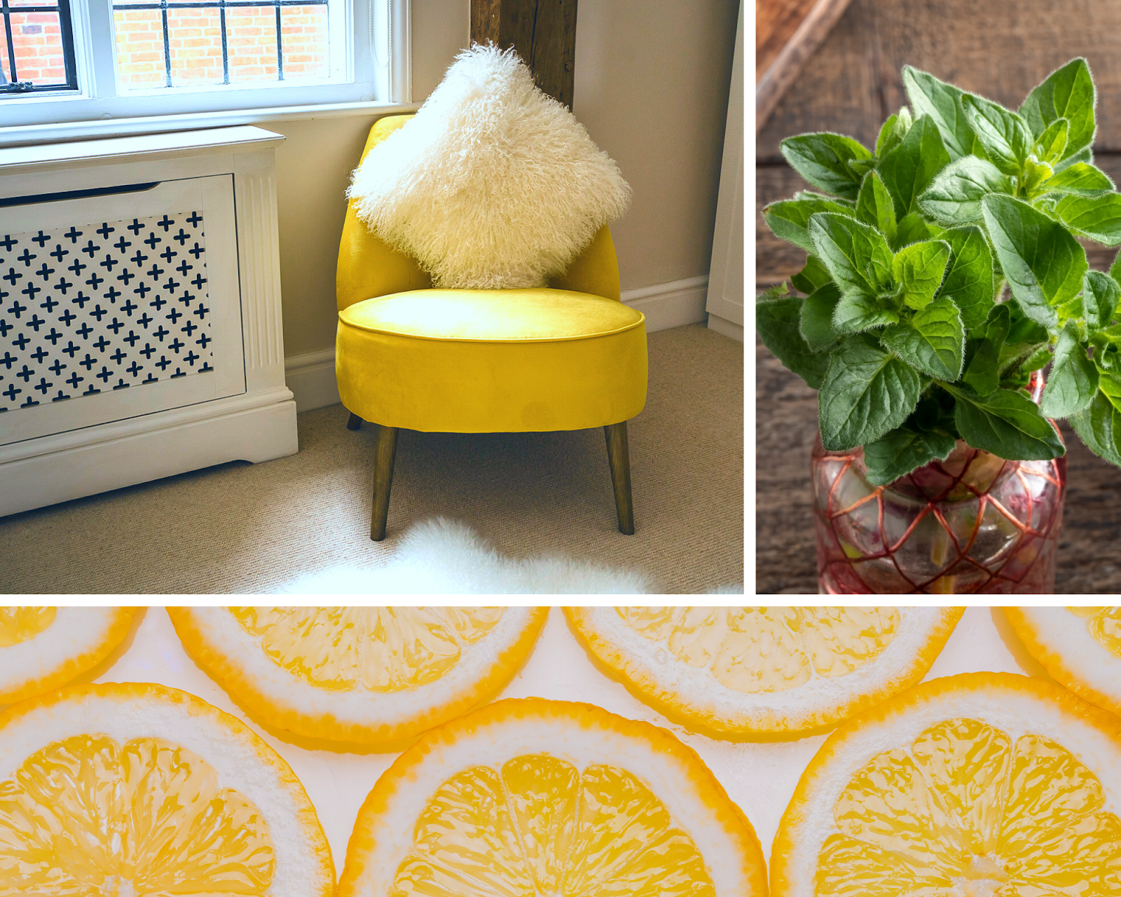
Bold tropical shades of bright green and vibrant yellow are fantastic when used as accent colours and highlights in interiors. Not only do these bold shades found in nature help you to feel more alert and energised throughout your day, but they can also grab attention in a less exciting room.
We suggest using bright cyans and pineapple shades in rooms that are fun and designed to be invigorating, such as children’s playspaces and sun rooms.
Top Colours for 2023
In September 2022, we predicted the top interior colours for 2023 would be Lavender, Sunset Rose, Amber, Powder Blue and Emerald, but how have these matched up to the top colours for 2023 as named by the experts in the first few months of the year?
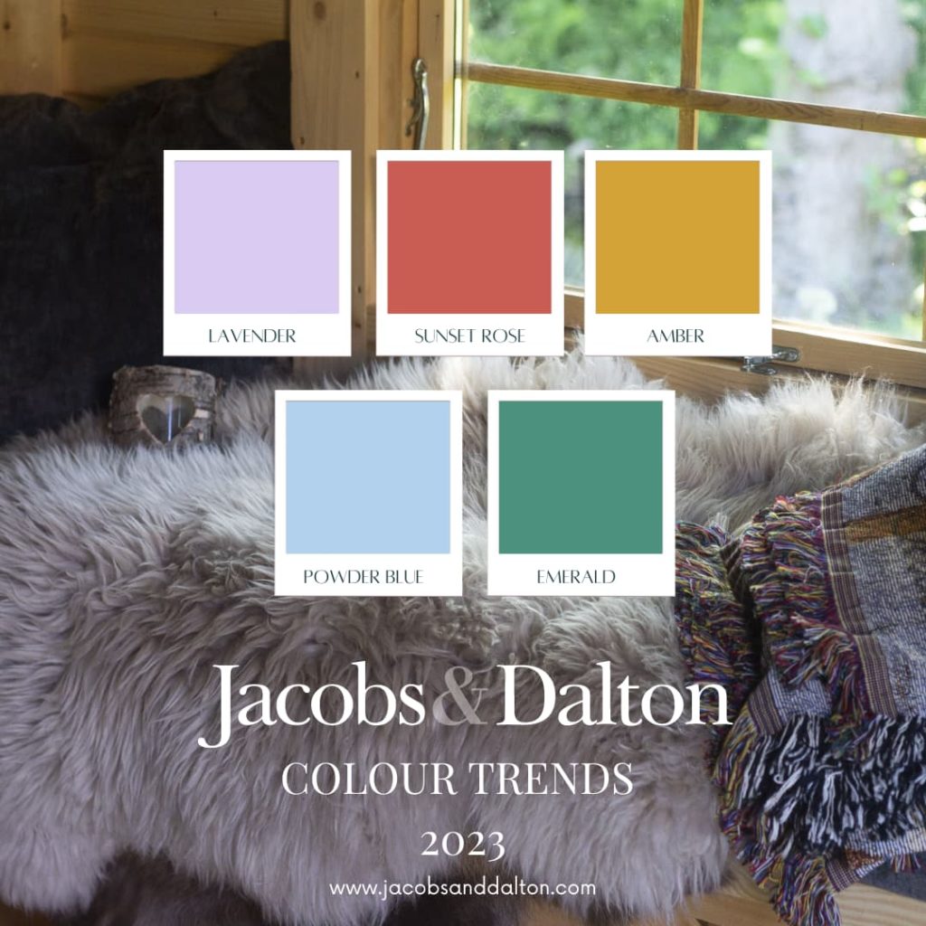
WGSN and Coloro have named the top colours for 2023 as Digital Lavender, Luscious Red, Sundial (an earthy yellow shade), Tranquil Blue and Verdigris (described as a copper green).
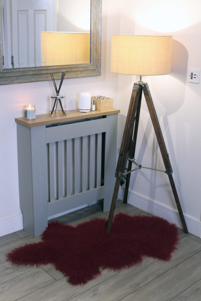
Pantone have named Viva Magenta as their colour of 2023 – a cool blood red. Perhaps our Burgundy Tibetan rug would fit the bill if you’re looking to incorporate this colour into your home in a natural, cosy way.
What are your favourite colour palettes in the home and how do they make you feel?