3 Interior Colour Trends for 2021 & How To Use Them
Colour trends aren’t just about what a random person thinks will look pretty in a given year. Whole boards of experts sit together to come up with a shade that represents the coming year as a whole. They base these discussions on progressions of previous years’ colour trends and predictions for what will be popular in not only interiors and fashion, but also on TV, in video games and on social media; socio-economic impacts, what we’ve been through and what’s to come in the wider world; and even on psychology, how colour affects us in our lives and what we need as a society.
The colour in the world around us has a huge impact on our daily lives – imagine if your walls were bold red and your carpets bright yellow, you’d be living in a constant headache! Or if the grass and trees were always the same dull grey shade as the winter sky, there would be little inspiration to be had.
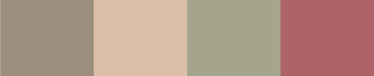
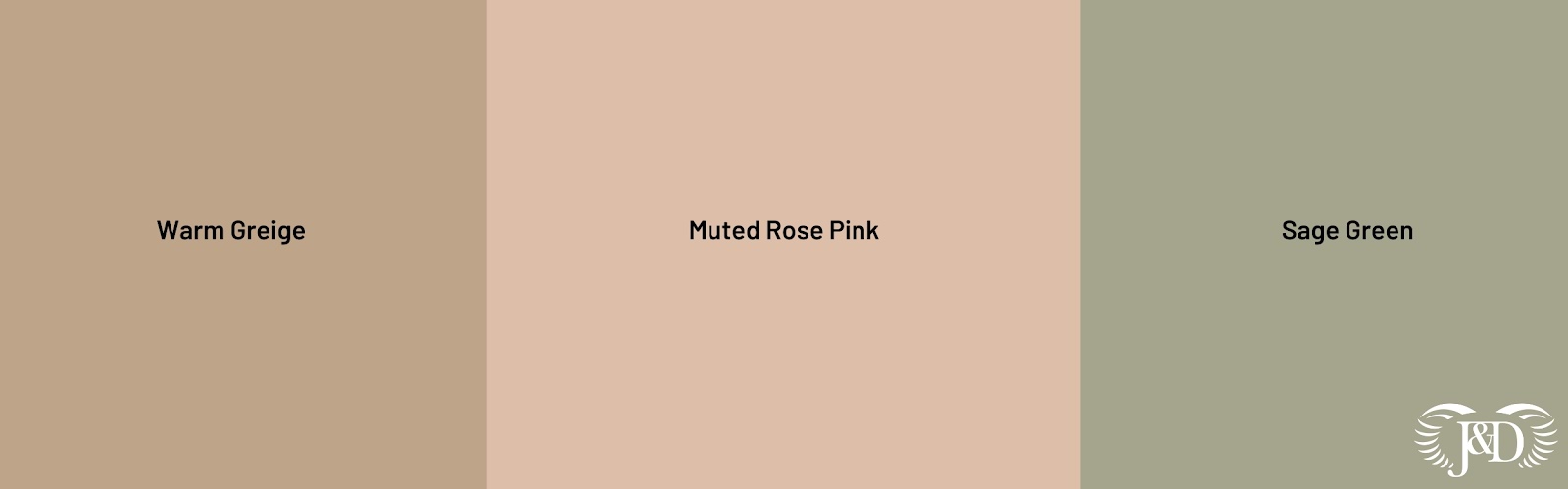
There are 3 words we’d use to describe our take on colour trends forecast for 2021:
- Mindful
- Nostalgic
- Grounding
And here are the 3 colours we’ve picked out for interiors in 2021 and some ideas on how to use them:
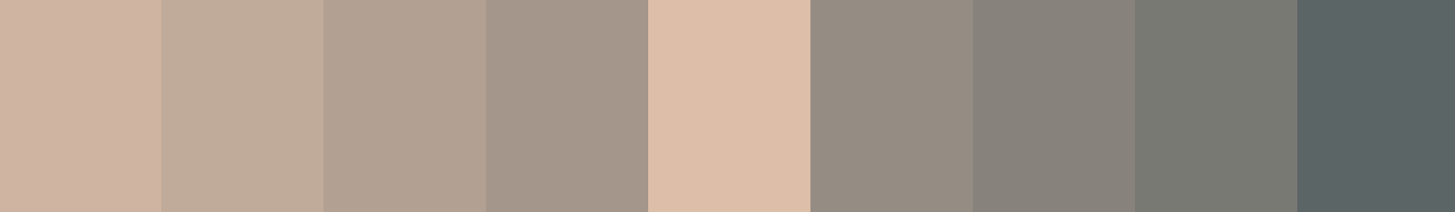
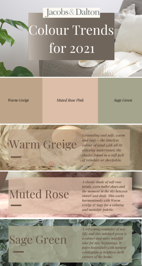
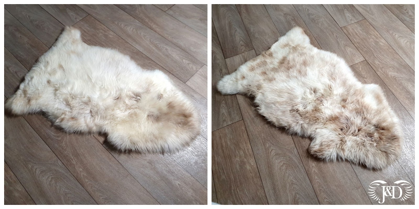
Warm Greige
Brave Ground has been named by Dulux as their colour of the year for 2021, and we couldn’t agree more that this warm, earthy tone of grey-beige is the perfect shade for the coming year. They describe it as creating a feeling of “stability, growth and potential”, something we all need right now!
What we love most about this shade is the connection it has with nature. It ties perfectly into the viral aesthetic trend on TikTok of cottagecore – a return to the simple life, but with whimsical ties to folklore as an escape from the busy online lives we lead. It feels grounding and safe, warm and cosy – the timeless colour of sand with all its relaxing undertones; the shades found in a soft pelt of reindeer or sheepskin.
And the best thing about this shade? It’s perfect with any other colour, but also stands on its own feet as a standout neutral in interiors. The bestsellers in our sheepskin rugs collection are our gorgeous natural creams and natural speckled rugs that have swathes and flecks of this lovely shade:
Here are a few examples of ways you could use this colour in a palette in your home:


Sage Green
Sage green is the cooler contrast to 2021’s warm greige. It still harks back to the peace and calm of nature, pairing beautifully with natural wood grain, and brightening dark corners of the home.
Whoever said that green wasn’t a neutral shade would be lying – think of the natural world and all its gorgeous greens, from the vibrant shade of a lime and the deep rich hue of a rainforest to the muted velvet of a sage leaf. Shades of green are a refreshing reminder of new life, and this slightly subdued version is a calmer and more mindful take on a new beginning in 2021.
Here are a few examples of ways you could use this stunning shade in your home:


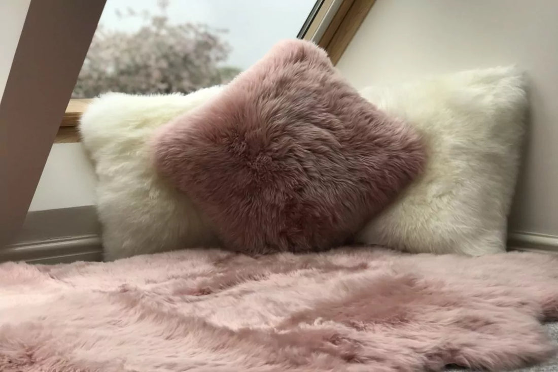
Muted Rose Pink
Muted rose pink is, unsurprisingly, that classic shade of soft rose petals, worn ballet shoes and the moment in the sky between sunset and dusk. This works harmoniously with the other colours of 2021 to bring them all together in a calming and grounding palette that’s reassuring.
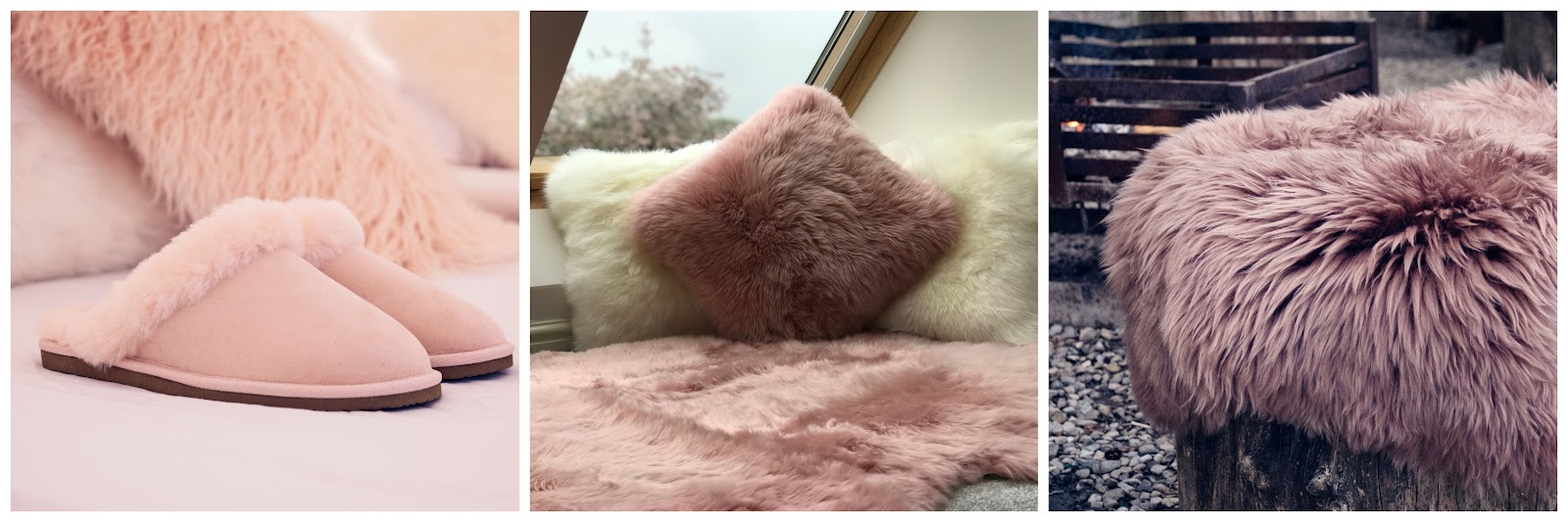
Our Rosa Pink Sheepskin rugs and cushions have been more popular than ever lately, and we believe it’s partly due to the nostalgic quality of this shade. The ever iconic millennial pink that took over Instagram feeds in the past few years has had its moment in the sun, but those millennials are growing up. They’re returning to pink but in a softer hue that’s more sophisticated and better suited to a cosy hygge home.
Here are our favourite ways to incorporate muted rose pink into a colour palette for your home: